
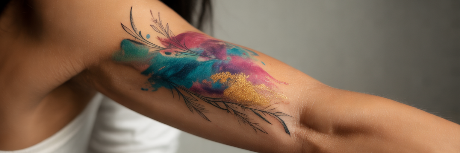
Tattoo pigments do not sit on the surface of the body like paint on canvas. Instead, they settle into the dermis beneath a regenerating layer of melanin-rich epidermis. Because your complexion acts as a permanent natural lens over every drop of ink, designing a vibrant watercolor tattoo requires a personalized understanding of color theory and skin undertone.
How Your Natural Skin Filters a Watercolor Tattoo
The Epidermis as a Translucent Window
When you bring a digital reference photo into the studio, it is completely natural to hope those exact shades will transfer straight onto your arm or shoulder. However, human physiology plays an active role in how body art looks once healed. Tattoo needles deposit pigment into the stable dermis layer, while your outer epidermis heals right over the top. Think of your healed epidermis as a translucent, lightly tinted glass window sitting permanently over the artwork. Because every person has a unique tint to their window, a design copied from another person's body will never yield an identical result on yours. Rather than fighting this natural filter, bespoke artistry celebrates your individual complexion by adjusting contrast and pigment saturation specifically for you.
Working With Cool, Warm, and Neutral Undertones
To make fluid color washes glow, we look closely at how your underlying skin tones optically mix with translucent inks. Cool undertones carry subtle pink, red, or bluish hints, while warm undertones feature golden, yellow, or peach hues, and neutral skin balances both. Because watercolor techniques rely on diluted transitions, your undertone interacts directly with the pigment. For instance, a warm golden undertone acts like a delicate yellow glaze over the ink, which can subtly shift a cool sky-blue wash toward seafoam green unless your artist custom-balances the violet and blue ratios beforehand. We explore this collaborative balance extensively in our guide on blending watercolor techniques into custom fusion pieces, where personalized color mixing ensures your design harmonizes with your aesthetic. Ultimately, every complexion can wear fluid styles beautifully when the palette is custom-mixed to complement your natural undertones.
Matching Pigment Palettes to Light, Medium, and Deep Complexions
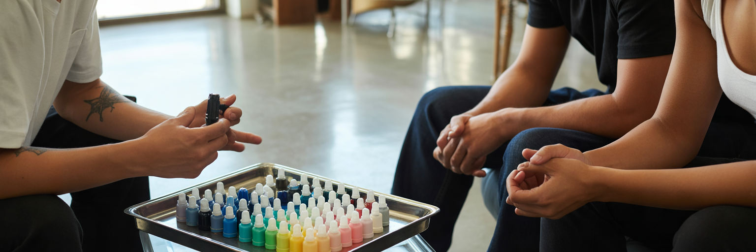
Once we understand how your undertone shifts hue, the next step is selecting the best tattoo colors for skin tone harmony across different levels of melanin richness.
Fair and Light Complexions
Fair and light skin offers wonderful flexibility for delicate pastels, soft lilac, and airy gradients. However, pale skin comes with a surprising pitfall. Ultra-pale washes like lemon yellow, sheer baby pink, or pale peach carry very little visual weight against a light background. Without darker contrasting neighbors like cobalt or deep plum to frame them, these subtle tones can easily wash out or fade prematurely after just a few summers.
Medium, Olive, and Warm Tan Tones
Across Singapore and Southeast Asia, medium, olive, and warm tan complexions are especially common and offer a rich canvas for expressive color work. Because olive and golden skin naturally neutralizes overly pale pastels, high-chroma warm tones and saturated cools perform exceptionally well here. Warm earth tones, terracotta, vibrant corals, and rich turquoises pop vividly against golden undertones, creating a luminous warmth that never looks chalky.
Deep and Melanin-Rich Skin
Planning a watercolor tattoo on dark skin is all about embracing bold saturation and clear tonal contrast. Sheer, low-contrast pastels lose visibility as the skin heals over them, whereas concentrated jewel tones retain remarkable clarity. Deep teals, royal blues, crimson, emerald, and rich magentas work with melanin rather than competing against it, delivering lasting vibrancy that feels lively and intentional.
| Skin Complexion & Undertone | Most Vibrant Watercolor Pigments | Shades That Require Caution | Key Artistic Strategy |
|---|---|---|---|
| Fair to Light (Cool or Pink Undertones) | Cobalt blue, emerald, lavender, dusty rose, cool magenta | Unbordered pale yellow, sheer white washes, very light peach | Pair soft pastel gradients with deeper mid-tone washes to prevent pale edges from disappearing |
| Light to Medium (Warm or Neutral Undertones) | Sunset orange, turquoise, plum, ruby red, botanical green | Muted beige, dusty grey-blue, low-opacity pastel pink | Account for warm yellow skin filtering when mixing blues and purples to keep hues true |
| Medium to Olive (Golden or Greenish Undertones) | Rich teal, vibrant coral, terracotta, deep violet, gold ochre | Pale lilac, sheer baby blue, desaturated mint | Select high-chroma warm and jewel pigments that harmonize with natural olive richness |
| Deep & Melanin-Rich (Warm or Cool Undertones) | Royal blue, crimson, rich magenta, deep emerald, concentrated berry | Sheer pastels, pale yellow, unanchored light orange | Prioritize dense pigment saturation and bold contrast over sheer dilution for lasting clarity |
By prioritizing strong tonal contrast over sheer lightness, your artist ensures that fluid splashes remain expressive and clearly defined on any shade of skin.
Structural Design Techniques That Keep Fluid Art Legible
Beyond color selection, clients frequently ask us about watercolor tattoo longevity and how to prevent soft gradients from blurring over time. Because painterly washes intentionally omit heavy traditional outlines, their soft color edges naturally diffuse slightly as your skin ages and cells turn over. Without an underlying skeleton, a purely lineless splash of color can lose its recognizable shape after several years.
The proven artistic solution is designing a fine line watercolor tattoo that pairs fluid color blends with crisp structural elements. Anchoring translucent splashes with delicate blackwork, micro-realism details, or solid black silhouettes gives the human eye a permanent focal point. Even as the surrounding color softens gracefully with age, the core artwork remains sharp.
During the design phase, our artists rely on four structural techniques to preserve readability over decades:
- Fine-line botanical or geometric framing that holds the core silhouette intact while allowing pigment splashes to spill naturally outside the borders.
- Strategic negative space, which leaves intentional pockets of un-inked skin within the composition to create breathing room and prevent adjacent colors from blurring into a muddy tone.
- Graduated pigment density that places dark, concentrated ink at the center of the motif and fades outward into softer edges.
- High-saturation jewel tones combined with flowing linework to artfully conceal old ink and redirect visual attention during bespoke reworks, an approach detailed in our article on transforming faded tattoos into new art.
Blending fluid color washes with a solid structural foundation gives you the best of both worlds: soft painterly movement alongside multi-decade legibility.
Collaborating With Your Artist and Testing Colors First

Choosing the right palette should never feel like a guessing game. When you sit down for a consultation, your artist's goal is to translate your personal story into a palette that flatters your complexion in real life, not just under studio spotlights. Before the needle ever touches your skin, we encourage you to take four practical steps during your consultation:
- Ask to view unedited, healed portfolio photos on skin tones similar to yours rather than relying on fresh tattoos enhanced by studio polarizing lenses or social media filters.
- Discuss the personal milestone or meaning behind the piece so your artist can align emotional color psychology with your natural skin harmony.
- Request a custom skin-tone swatch comparison where candidate pigment bottles or skin-safe markers are held directly against your skin in natural daylight.
- Opt for a quick color patch test, where your artist tattoos tiny dots of candidate pigments in an inconspicuous spot, allowing you to observe how the ink settles over 4 to 6 weeks before committing to the full piece.
Partnering with an experienced custom tattoo studio in Singapore makes this collaborative preparation effortless. At our Memory Lane Tattoo Studio, artistic director Apple Qu brings over 20 years of experience to every consultation, working closely with local residents and international guests to co-create bespoke pieces rather than repeating generic flash templates. Open communication and patient testing remove all uncertainty so you can step into your session with complete confidence.
Smart Body Placement and Tropical Sun Protection
Selecting Low-Friction Canvas Zones
Where you place your artwork plays a major role in how crisp those watercolor transitions remain years down the road. Delicate color blends thrive on smooth, low-friction areas of the body such as the inner forearm, upper arm, thigh, or back. Conversely, high-friction zones like fingers, palms, wrists, ankles, and feet have thicker calloused skin and rapid cell turnover, which cause soft watercolor washes to fade rapidly. You can explore how body contours affect both narrative flow and pigment retention in our strategic guide on choosing the right tattoo placement.
Protecting Delicate Washes in a High-UV Climate
Living in or visiting Singapore means contending with a year-round high UV index and intense tropical sunlight. Ultraviolet rays penetrate the epidermis and break down lighter watercolor pigment molecules much faster than dense black carbon ink. We cover the science of equatorial sun care in our dedicated guide on maintaining tattoo vibrancy in the tropics, which pairs seamlessly with three daily habits that protect your investment:
- Strict sun and swimming avoidance during the initial 3 to 4 weeks of epidermal healing while your new skin barrier closes.
- Daily application of broad-spectrum SPF 50+ sunscreen over the artwork once fully healed whenever stepping outdoors in tropical sunlight.
- Consistent daily skin hydration with fragrance-free lotion to keep the overlying epidermis clear, smooth, and luminous.
With thoughtful placement, bespoke color mixing, and mindful sun care, your personalized watercolor artwork will stay bright and meaningful for decades to come.